Our internal foreign aid program
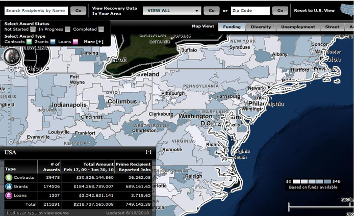
The US Recovery Act (aka “stimulus package”) has put out this great map of where the money is being spent by Congressional District.
As I looked at where the money is being spent in the part of the country pictured (the part I know best), there did not seem to be a lot of rhyme or reason between Congressional Districts as far as population or need. Is it random? Could it be (shock!!!) that where the money is spent depends on the party, power, and skill of the Congressperson from that district?
The other interesting thing about the graph is the summation of total spending $218.737 billion and the creation of 749,142 jobs. Did it occur to them that somebody might divide the first number by the second and come up with the number per job (slightly less than $300K). Did anything think of just paying workers $300K directly, and letting them stay home and read poetry?
Of course, I am outside my area of expertise here. Perhaps the main point that I can make is that it is really GREAT that the US government was so transparent as to put these maps up (and many more – go to the web site!), so that citizens (hopefully including more intelligent commentators than me) can give feedback. When will foreign aid spending have maps like this? I hear rumors the day may be coming…
 From Aid to Equality

