Development: the Greatest Story Ever Told
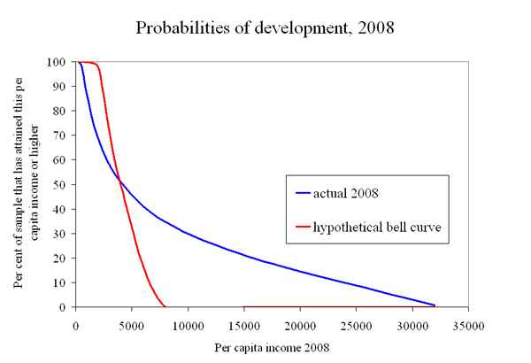
After all the efforts of the last 6 decades, only a minority of countries are developed. That seems like a sad indication that the odds are long as countries struggle to attain Development. Yet let's not take the Development that has been achieved for granted. If you beat the odds, the payoff is remarkably large (which is maybe why all of us are working so hard on Development!) As the figure shows, a third of the sample of countries is at $8000 per capita or better in 2008, and a fifth of the sample is $16,000 per capita or better. In this sample, there is a 1 percent chance of getting all the way to national average income per person of $32,000.
To put it another way, development does NOT follow the bell curve distribution thought to be “normal” for many things (which is why the bell curve is called the “normal” distribution). The hypothetical bell curve in the figure gives you basically ZERO chance of ever getting above $8000.
Another way of illustrating how LARGE the payoff to development is, contrast it with something that does follow a bell curve: human height. American males have an average height of about 5’ 9 ½ inches (1.77 meters). Using the actual bell curve for their height distribution, American males have about a 1 percent chance of being 6’ 4’’ or taller (1.93 meters). But if height followed the same distribution as development, there would be 1 out of every 100 American men taller than 46 feet! (14 meters!). (Try fitting THEM into your family picture.)
The boring technical jargon is that development has a “fat-tailed” distribution. The normal bell-curve distribution is not “fat-tailed” because its right tail in the figure above vanishes quickly, while the development distribution has a right tail, that is, well, Fat.
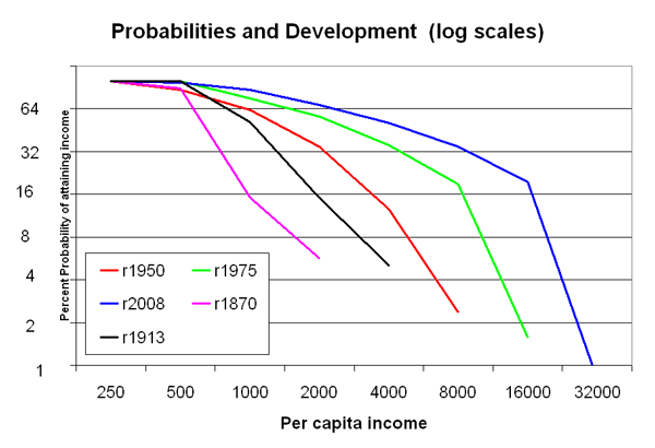
It’s easier to see what is going on with fat-tailed distributions when using log scales, shown in the second figure. With these log scales, every additional movement along the scale is a DOUBLING of the previous level. So move down the “probability” vertical axis, where every step down cuts your probability in half, but at the same time roughly doubles your per capita income payoff.
Moreover, the graph shows the distribution at different points in time: 1870, 1913, 1950, 1975, 2008. The payoffs keep getting better for the same probability. Or to say it another way, as you move from 1870 to 2008, the attainment of higher and higher per capita income levels becomes more likely. In fact, the definition of what income level represents “Development” has to keep changing because the whole distribution is moving to the right.
So first the bad news and then double good news. The bad news is that the odds are long to attain “Development.” The double good news is that (1) the Development prize is remarkably Large, and (2) it keeps getting Larger.
From Greek myths to Hollywood romances, we all love the story of the Hero who overcomes long odds to attain a Remarkable Prize (the Golden Fleece, the woman of my dreams, etc.)
Development then should also be one of the greatest stories ever told.
Wonky footnotes: I am obviously leaving out a lot of necessary details and further discussion. Two famous fat-tailed distributions in statistics are the log-normal and the Pareto. The Pareto distribution would show up in the second figure as downward sloping lines that are exactly straight (which are called Power Laws, a topic which has a huge literature and generates wild excitement in some quarters). Income per capita across countries appears to follow more the log-normal distribution. I am more interested in development being fat-tailed than in whether it is following exactly a Power Law. Countries dominated by oil income are omitted from the distributions. The source for the per capita income data is Angus Maddison, updated to 2008 with WDI. It goes without saying that per capita income numbers are shaky (and even more so as you go back in time), but I think the qualitative story is probably mostly right despite shaky individual numbers.
 From Aid to Equality


