Hey, fellow committee member, are you the weakest link?

UPDATE: 12:18 PM SEE END OF POST I was just on a committee that selected a small number of papers from a large number of submissions for a conference.  We each graded each paper and then we had to come up with a rule to go from our individual grades to a ranking of the papers to decide which ones got into the conference. So here are some possible rules:

(1) one veto kills the paper

So the overall grade for the paper equals the minimum of all of our grades, so if even just one of us flunks the paper, the paper flunks. You need to satisfy all of us. In econ lingo, you can't SUBSTITUTE one of us with a positive opinion for another one of us with a negative opinion.

ANALOGY: the "weakest link" production function, in which whatever input the economy has least constrains the whole output. Note that zero substitution means that all inputs/committee members are perfect complements. This is the world view of those who like Big Pushes to increase all the development  inputs at once.

(2) simple average

Averaging our grades goes to the other extreme of perfect SUBSTITUTION between us. One of us with a positive opinion cancels out (i.e. substitutes for) another one of us with a negative opinion. We committee members are not complements at all: the value of my grade is not influenced by your grade.

ANALOGY: the old Human Development Index.

Also in production functions relating Development to inputs, this rule  implies extreme flexibility. Rich economies feature this selectively to compensate for weakest links -- if the whole system is going to fail because of one input, then have a backup input that is a perfect substitute.

(3) geometric averages

This exotic animal  (cube root of the 3 grades multiplied together) is in between (1) and (2). You can partially but not completely substitute for one of us with another one of us. So for example if we were just grading A,B,C (numerically 3,2,1), then a paper with the score (2,2,2) has a higher geometric average than a paper with the grades (3,1,2) although they both had the same simple average under 2. We are also partial complements -- the higher is your grade, the stronger is the effect of my grade.

ANALOGY: the new Human Development Index, which an Aid Watch post criticized for TOO MUCH complementarity. The higher was committee member Per Capita Income, the stronger was the effect of another committee member Life Expectancy, which has the unappealing property that we value lives of rich people far more than those of poor people. Makes more sense for production functions than for HDI.

The ending of the actual committee story-- qualitative discussions were necessary for choosing the final papers in the end after constructing the mechanical indexes. Let me see what is the analogy here...

UPDATE: thanks to both of you for reading this wonky post all the way to the end. Do you think I have atoned for that Swimsuit Edition post now? and even the followup Swimsuit Edition post also?

Read More & Discuss

Third World America

UPDATE 11:20AM: accused of Detroit "poverty porn", see response below. As you may have noticed, this blog sees America itself as an interesting development laboratory. Others seem to agree, as a new report applies the Human Development Index to the US.

The site has a cool mapping function. Here is a map of health that locates Third World America in the Deep South and its borderlands.

The South as Third World holds up controlling for race and gender, as the same area shows the highest concentration of white females with less than high school education.

Of course, in metro areas we have an inner city Third World hiding in plain sight.  Here is Detroit for example, right next to "First World" Pontiac:

Commenters accuse Aid Watch of some kind of "poverty porn" on Detroit.

OK, I already apologized for my catastrophic bonehead mistake of carelessly applying the label "downtown" to the negative picture (now removed).

As further recompense, here is a nice happy positive picture of the real "downtown Detroit." Unfortunately, I have to stick by the original characterization of much of Detroit as belonging to the "Third World" part of America, based on all the evidence on unemployment, poverty, etc. that I have examined in detail. It's going to take more than a few happy pictures to fix that.

Have fun on your own exploring Third World America on this great site.

Read More & Discuss

Human Development Index debate…you still want more?

I suspect that we long ago exhausted the patience of our readers with our multiple rounds of debate on the Human Development Report's new methodology for its Human Development Index. At the same time, I feel an obligation to let the other side of the debate have their say as much as they want. So here is UNDP's new response to Martin Ravallion's response to UNDP's previous response to our original blog criticizing the new Human Development Index, as well, crazy.

Read More & Discuss

Substitutability: there is no substitute for learning this wonky concept if you want your project to succeed

The debate we had on the HDI brought up the seemingly drop-dead boring jargon “substitutability.” Surprise! This actually turns out to be a USEFUL concept. Consider two extremes in an everyday example.  For producing the output: “weird music that Bill listens to,” my iPod and my iPhone are perfect substitutes, so one is redundant for this purpose (forget about other purposes for now). For producing this same output, headphones and the iPod are NOT substitutes, they are BOTH required in the proportions: 1 set of headphones for every 1 iPod. So headphones and iPods have zero substitutability.

The exact opposite concept to substitutability is complementarity. Headphones and iPods are perfect complements (you can’t use one unit of either without one unit of the other). At the other extreme, iPods and iPhones have zero complementarity (you CAN use one without the other). This is just a description of technology as it is at the moment, that we might have to take as given (but maybe not, see below).

So why does this matter for, say, aid projects? Aid projects often run into trouble because one of the essential inputs (one of the “complements”) for the desired project output goes missing. So for example, the supply of clean water breaks down because one small part fails on the water pump at the well. None of the other components of the water supply are worth anything as long as the one part of the pump stays broken.

This is a common problem. Indeed, many disasters are caused by the failure of one (sometimes very small) complementary input, like the malfunctioning O-ring that caused the 1986 Challenger Shuttle explosion.{{1}}

Yet the idea of complementary inputs over-predicts the likelihood of disaster – there are so many different parts that could fail, any one of which would be fatal, you would expect MOST Shuttles to fail. Or you would expect a lot more airline disasters than actually happen, since airplanes are subject to the same problem.

So why are more airplanes not falling out of the sky? Airplane designers do not passively accept perfect complements, they add many backup (redundant) systems in case one part fails. In other words, they deal with a complementary (essential) input by creating a perfect substitute for it in case it fails. I follow the same principle when I carry around both my iPod and my iPhone, to avoid the catastrophe in which the battery runs out on one and I can’t listen to my eccentric music.

The lesson for aid projects is to also build in redundancy for the essential complementary inputs. Make sure you have a good backup system of repairmen and spare parts in case the water pump breaks down. This seemingly obvious advice is often not followed–for example in Malawi, between 30 and 40 percent of all waterpoints don’t work.

Oh, and a final word on the HDI debate. Under their old method, UNDP assumed that inputs into the index (like income and life expectancy) were perfect substitutes, so the amount you have of one doesn’t affect the usefulness of the other. This means that even if, say, Zimbabwe has almost no income, it still gets some credit if life expectancy rises.

The new HDI method instead treats these inputs as complements, meaning that a missing input (or an income level very close to zero) would produce the catastrophe of zero overall human development, just as an iPhone with no headphones nets us no music at all.

In our critiques of the HDI, Martin Ravallion, Laura Freschi, and I thought this was way too extreme. People are resourceful enough to “produce” human development even if their income is extremely low, when they will find back-up substitutes for “low material income.”

An important part of development in general is developing systems that provide back-up redundancies for any essential input into production. Development is also the growth of resourcefulness to work around bottlenecks of any one particular scarce input.

And so, class, today’s lesson is: Aid project managers should imitate this resourcefulness. Whenever you get stuck by complements, look for substitutes.

[[1]]In fact, Michael Kremer used this as an analogy for development failures in his classic paper “The O-ring Theory of Economic Development”[[1]]

Read More & Discuss

Human Development Index Debate Round 2: UNDP, you're still wrong

by Martin Ravallion, Director of the Development Research Group at the World Bank

Francisco Rodriguez has defended the HDI against recent criticisms by Bill Easterly and Laura Freschi, who drew in part on my new paper, “Troubling Tradeoffs in the Human Development Index.”

Francisco would make a good lawyer, since he defends his case vigorously on multiple fronts. But this leaves a puzzle about his true position. On the one hand he claims that tradeoffs—including the implied monetary valuations of extra longevity and schooling—are not relevant to the HDI, and that it is even “incorrect” to calculate them. But (on the other hand) he agrees that the old HDI was deficient because it assumed constant tradeoffs (perfect substitution). If he does not care about the HDI’s tradeoffs then why does he care about how much substitution is built into the index, which is all about its tradeoffs?

The tradeoff built into any composite index is just the ratio of the (marginal) weight on one of its underlying variables (such as longevity in the HDI) to another (such as income). There is nothing “incorrect” in wanting to know the HDI’s weights and implied tradeoffs. These are key properties for understanding and assessing any composite index.

And the implicit weights and tradeoffs in the new HDI are questionable. I find that the HDI’s valuations of longevity in the new HDI vary from an astonishingly low $0.51 for one extra year of life expectancy in Zimbabwe to $8,800 in Qatar. The valuations are lower than for the old HDI, especially in poor countries.

And this striking devaluation of longevity is not just due to the fact that the HDI puts declining marginal weight on income, as Francisco suggests. As my paper shows, the weight on longevity itself has declined due to the change in methodology, and substantially so in poor countries.

Francisco defends the new HDI on the grounds that it allows imperfect substitution between its components. This is a non sequitur. One can introduce imperfect substitution without the questionable features of the new index. Indeed, I showed in my paper that if the HDI had used instead the Chakravarty index—a simple generalization of the old HDI, with a number of appealing properties—it could have relaxed perfect substitution in a less objectionable and more transparent way.

I agree with Francisco that perfect substitutability was a dubious feature of the old HDI, and (as he points out) the index was criticized from the outset for this feature. It is a shame that it took 20 years for the Human Development Report to fix the problem. And it is an even bigger shame that the proposed solution brought with it new concerns.

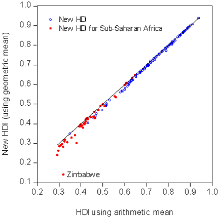
One such concern is the substantial downward revision to the HDI for many countries in Sub-Saharan Africa (SSA), which Easterly and Freschi pointed out. Francisco questions their claim, but the data are not on his side. The graph shows the pure effect of the change in the HDI’s aggregation method. (I have held everything else constant, at the same data used by the 2010 HDI.) Switching to the geometric mean involves a sizeable downward revision for countries with low HDIs, and these are disproportionately found in SSA.

This is not to deny that much of SSA is lagging in key dimensions of development, as Francisco notes. The point here is to separate the role played by the questionable new methodology used by the HDI.

Maybe it is time to go back to the drawing board with the HDI. Deeper consideration of what properties the index should have—especially its tradeoffs—would be a good way to start.

--

Related posts: The First Law of Development Stats: Whatever our Bizarre Methodology, We make Africa look Worse What the New HDI tells us about Africa Human Development Index Debate Round 2: UNDP, you’re still wrong

Read More & Discuss

What the New HDI tells us about Africa

by Francisco Rodríguez, Head of Research at the Human Development Report Office In a post published last Thursday, Bill Easterly and Laura Freschi criticize the new formula for the Human Development Index (HDI) introduced in this year’s Human Development Report.  Borrowing on a recent paper by the World Bank’s Martin Ravallion, Easterly and Freschi argue that our decision to shift from an additive to a multiplicative mean makes Africa look much worse than it should.

The relevant question, of course, is not whether the index makes any particular region or country look better or worse but whether the methodological changes introduced in the new version of the HDI make sense.  If we reject the methodology, we should do it based on the soundness of its principles, not on whether or not we like its conclusions.

Why the HDI has a new functional form – and what it means

One of the key changes to the HDI functional form introduced in this year’s report was to shift from an arithmetic to a geometric mean, thus introducing imperfect substitutability into the index. Imperfect substitutability means that the less you have of something, the more you will benefit from improvements in that dimension. By contrast, perfect substitutability (which had characterized the index’s old formula) means that how much you care about one dimension has nothing to do with its initial value. The old perfect substitutability assumption had been extensively criticized, with good reason.{{1}}

Easterly and Freschi misinterpret the rates of substitution in the HDI as saying something about the “value” of a life.  But the HDI is not a utility function, nor is it a social welfare function.  It is an index of capabilities.{{2}}  What the huge differences in trade-offs between health and income in the index tell us is actually something quite simple: that income contributes very little to furthering capabilities in rich countries.  Societies may and do value other things than their capabilities, so it is incorrect to read these numbers as “values” of anything.

For more on why it is incorrect to read “values” into the HDI, read the longer version of this article.

Does the new HDI make Sub-Saharan Africa look worse?

What is the net effect of the new functional form on the relative position of Africa vis-à-vis the rest of the world?  In the 2010 Human Development Report, Africa’s average HDI stands at .389, or 62.3 percent of the world HDI.  If we had applied the old functional form, then Africa’s HDI would have been 64.1 percent of the world average.  So does the new HDI make Africa look worse?  Yes, exactly 1.8 percentage points worse.  While one can of course try to make a big deal about that, as Easterly and Freschi do picking up on the former’s earlier complaints about the MDGs, it seems that nothing in the general picture of Africa’s relative progress vis-à-vis the rest of the world really changes from the new functional form.

Easterly and Freschi also object to the HDR’s measure of progress, which they claim is biased against Africa.  First of all, it is not clear that it would be a good thing if a measure of progress ranked Africa highly for the past forty years, a period that includes the disastrous 1980s.  But if they were right and our measure was incapable of capturing African progress, then we shouldn’t see Africa do well in any period.  However this is not the case. Indeed using the same measure of progress, Africa does remarkably well since 2000.  As  shown in Table 1 below, Africa has six of the top 10 performers in the world, including all the top five (Rwanda, Sierra Leone, Mali, Mozambique and Burundi). Odd results indeed for an index which by design is claimed to be biased against Africa.

For more on Africa’s human development progress, read the longer version of this article.

References

Desai, Meghnad (1991), ‘Human Development: concepts and measurement’, European Economic Review 35, p. 350–357.

Lind, Niels (2004), 'Values Reflected in the Human Development Index', Social Indicators Research 66, p. 283-293.

Sagar, Ambuj and Adil Najam (1998), ‘The Human Development Index: A Critical Review’, Ecological Economics 25, no. 3, June, p. 249-264.

Sen, Amartya (1980), “Equality of what?”, in S.M. McMurrin (Ed.), Tanner Lecture on Human Values, Vol. I, Cambridge: Cambridge University Press.

UNDP(2010) The Real Wealth of Nations: Pathways to Human Development. New York: Palgrave Macmillan.

[[1]]See, for example, Desai (1991), Sager and Najam (1998), Lind (2004).[[1]] [[2]]For the notion of capabilities and its relationship to the human development approach, see Sen (1980).[[2]] --

Related posts: The First Law of Development Stats: Whatever our Bizarre Methodology, We make Africa look Worse What the New HDI tells us about Africa Human Development Index Debate Round 2: UNDP, you’re still wrong

Read More & Discuss

The First Law of Development Stats: Whatever our Bizarre Methodology, We make Africa look Worse

UPDATE: Just received notice of drastic punishment for this post: invited to join HDR 2011 Advisory Panel I’ve complained previously about how design of the UN Millennium Development Goals make sub-Saharan Africa look worse than it really is. Now I realize that UNDP’s new Human Development Report (HDR) does the same thing. Not alleging any conspiracy here, it seems unintentional, but is then not caught because … well we all know Africa is supposed to look terrible.[1]

My HDR education comes from Martin Ravallion, who has a great new paper on the new methodology of the Human Development Index (HDI). (Martin does not mention the Africa angle, but provides the necessary insights described below).

Of course, UNDP has an impregnable position: while their results get huge publicity, the methodology behind the results is interesting to approximately 3 people.  As an avid promoter of hopeless causes, here goes…

The biggest change in method was that the new HDI is a geometric average rather than a normal (additive) average. Geometric average means you multiply the separate indices (each ranging between 0 and 1) for income, life expectancy, and education together and then take the cube root (I know your pulse starts to race here…)

Now, students, please notice the following: if one of these indices is zero, then the new HDI will be zero, regardless of how great the other indices are. The same mostly applies if one of the indices is close to zero. The new HDI has a “you’re only as strong as your weakest link” property, and in practice the weakest link turns out to be very low income (and guess which region has very low income).

So, as Martin noted, the new HDI relative to the old HDI penalizes countries with very low income compared to decent numbers on life expectancy and education. One reason I think this is unintentional is that these are exactly the cases that the HDR used to celebrate! The biggest losers here are Zimbabwe, Liberia, DR Congo, Burundi, Madagascar, Malawi, Niger, and Togo.

Martin makes the “decent life expectancy doesn’t help you if you have low income” point in a different way: the new HDI has vastly different numbers for the value of life between poor and rich countries. Martin had previously made this criticism of the old HDI in a paper published in 1997, which Aid Watch covered in a previous post. The HDR addressed this criticism by making the problem much worse. Previously we were all whining about differences in the value of life of 70 times between rich and poor – now it’s a differential of 17,000 to one. Sorry, Zimbabweans, UNDP thinks your lives are worth 50 cents.

But wait, Africa has another GREAT chance to perform well --  the HDR also gives mucho publicity to the “top movers” in HDI over 1970-2010, ranked in order of percentage increase. My old MDG paper mentioned above said Africa would look better on percentage increases in health or education indicators.  Indeed, Ethiopia, Burkina Faso, Niger, Mali, and Burundia all had more than a 300% increase in educational enrollments (using the UNDP’s own data) from 1970 to 2010.

So naturally, among the champion improvers are … Oman and Nepal … and no sub-Saharan African countries in the top 10. What happened?

In yet another twist, the HDR ranked the top improvers measured as deviations from the average growth in HDI of others at similar initial HDI in 1970. Since almost all of the bottom ranks of the HDI are sub-Saharan African (exacerbated by the above “weakest link” methodology), Africa will only do well if it does better on average than – Africa.

If we forget the deviations thing, and just rank by growth in the HDI from 1970 to 2010, then sub-Saharan Africa would get 6 out of the top 10 improvers.

If you have read this far, you get a medal. So what’s the lesson of all this mumbo-jumbo about methodology? Maybe you could make a case for the new methodology, but at the very least it’s clear that obscure choices of method make a big difference in who you celebrate – and who you make look bad. And way too often, Africa winds up in the latter category.

Postscript: we want to thank UNDP for generously making all their data and methodology available to us even though they knew we were critical, because they also generously gave reactions to a preliminary draft based on an earlier dataset we downloaded from the HDR website. They did not change our minds and the new dataset confirmed our earlier results. But we give them great credit for constructive engagement. The paper that describes their methodology is here.


[1] This post uses the words “Africa” and “sub-Saharan Africa” interchangeably, following common development-speak. North Africa is in a very different situation from that described here.

--

Related posts: The First Law of Development Stats: Whatever our Bizarre Methodology, We make Africa look Worse What the New HDI tells us about Africa Human Development Index Debate Round 2: UNDP, you’re still wrong

Read More & Discuss