“Proofiness:” trashing back on FAO hunger numbers

Just before the big UN meetings here in New York around the Millennium Development Goals, the FAO released new world hunger numbers, and Aid Watch listed reasons to worry that these numbers were “made up.” A blog post from Oxfam GB’s Duncan Green called our post “lazy and supercilious,” with the amusing headline “Easterly trashed.”  The accusation that I am “lazy” struck a raw nerve, and so I have responded forcefully by asking Laura to do more work.

A closer look at the FAO’s documents, along with information provided by smart Aid Watch commenters as well as the FAO’s own senior economist David Dawe validates, rather than “trashes,” many of the concerns Aid Watch raised.

For one, the methodology for the FAO survey numbers does not actually directly measure malnutrition but tries to estimate it indirectly based on a model of human calorie requirements and food availability and distribution:

From the total calories available, total calories needed for a given population, and the distribution of calories, one can calculate the number of people who are below the minimum energy requirement, and this is the number of undernourished people.

A modeled number is NOT the same as directly measuring malnutrition (as the WDI anthropometric numbers cited in the previous post attempt to do). Is the model correct? How did they test it? A model has many assumptions and parameters, which are inevitably less than 100 percent reliable. All of these make the modeled numbers subject to a LOT of uncertainty. Has FAO made any attempt to quantify the uncertainty? Have they tried comparing their estimates to the anthropometric measures in WDI?

Second, according to the FAO’s downloadable data charts, this exercise was last carried out in 2005-2007. These survey numbers are available for every country in the database (176 in all). The data tables tell us that while there is no country-level data for Iraq, Afghanistan, Somalia or Papua New Guinea, they are included in regional estimates, and there are country-level entries for places like Sudan, Zimbabwe and Libya for each three-year data collection period going back to 1990.

Neither of the most recent FAO State of Food Insecurity reports, from 2009 or 2008, includes discussions of the methodology for the 2005-2007 surveys. And neither explains how the 2008 figures were obtained. The 2009 report’s tables list as sources UN population data from 2006, and “FAO estimates” for undernourishment.

Third, the estimates for 2009 and 2010 are not only based on very indirect and noisy links between capital flows, imports, terms of trade and food availability, but the numbers for the former are not real numbers but based on USDA projected scenarios using IMF estimates for quantities that are notoriously difficult to estimate or project.

The comments from FAO economist David Dawe suggest (quite logically) that the economists, statisticians and policy-makers responsible for the FAO numbers are well aware of the drawbacks of the methodology they’ve chosen to produce both the survey year data and the estimates for years with no surveys at all; entire conferences and volumes are devoted to debating how to measure food deprivation.

Of course, none of this ambiguity and caution makes it into the papers. The New York Times reported simply that the UN said Tuesday, September 14 that the “the number of hungry people fell to 925 million from the record high of 1.02 billion in 2009,” but that “the level remains higher than before the 2008 food crisis.”

An alternative narrative based on the above would be something like: “the UN attempted on Tuesday to provide some projections for 2010 of the number of hungry people in the world compared to previous projections for 2009, all of which are in turn based on a combination of remarkably shaky links to other projections of impossible-to-project factors like capital flows, unverified and uncertain models of hunger and food availability, an unexplained estimate for 2008, and a survey of uncertain coverage and usefulness last conducted in 2005-2007.”

A new best-selling book called Proofiness opens with a quote that we are “vulnerable to the belief that any alleged knowledge which can be expressed in figures is in fact as final and exact as the figures in which it is expressed,” then the rest of the book explains why this “proofiness” is really “mathematical deception.”

Aid Watch will continue its lazy and supercilious attacks on proofiness.

Read More & Discuss

FAO senior economist responds on “made-up world hunger numbers”

We received this comment this morning from David Dawe, senior economist at FAO, in response to Wednesday's post Spot the made-up world hunger numbers. Kudos for the prompt reply and the willingness to engage in discussion.

Dear Professor Easterly,

I am a leader of the technical team in FAO responsible for publication of the State of Food Insecurity in the World, which reports FAO’s estimates of undernourishment every year. I would like to clarify the methodology behind the recently reported estimates of undernourishment for 2005/07 and 2010. FAO attempts to measure the number of people in the entire population (i.e. of all ages) for whom caloric intake is below a threshold, what we call the minimum dietary energy requirement. This is a different way to measure hunger than the anthropometric estimates published in World Development Indicators, which measure the nutritional situation of children under 5 years of age.

There is no need to summarize FAO’s methodology here – a brief summary of it is publicly available here , as noted in the blog post by Richard King. A more detailed discussion (411 pages) of FAO’s methodology and related measurement issues can be found here, which reports the results of an international scientific symposium held in 2002 on the measurement and assessment of food deprivation and undernutrition. In addition, the data for reproducing FAO’s country estimates for 2005-07 are publicly available here.

As noted by Richard King in his blog post, lags in data collection prevent FAO from using this same method to construct undernourishment estimates for 2009 and 2010. Instead, we have to use models to get estimates for more recent years. Therefore, to get the number of undernourished people for 2009 and 2010, we applied estimates of percentage increases in undernourishment from the USDA Food Security Assessment model to our own estimates of the level in the previous year. A short summary of the USDA model was provided on pages 22-26 in the State of Food Insecurity 2009. A longer publication (from USDA) that describes the model in more detail and its estimates is also available.  Referring again to Richard King’s blog post, he provides an excellent summary of the shortcomings of applying the USDA model to our own estimates, so there is no need to repeat them here. In addition, note that our model-based estimates do not take into account the floods in Pakistan or recent increases in wheat and maize prices on world markets.

As with any methodology for constructing global estimates of socioeconomic variables, it is subject to many valid criticisms, and some of these criticisms are available in the published literature (e.g. Peter Svedberg, 1999, 841 million undernourished?, World Development 27 (12): 2081-98). Some of the criticisms suggest that FAO overestimates the extent of under-nutrition, while others suggest that our estimates are too low. A recent World Bank Working Paper provides estimates of the impact of the crisis that are roughly similar to ours (Sailesh Tiwari and Hassan Zaman, 2010, The impact of economic shocks on undernourishment, World Bank Policy Research Working Paper 5215). Whatever the estimate may be, FAO welcomes such criticisms and alternate methodologies so that the world has a better quantitative understanding of the extent of this problem.

While we stand by our current estimates, we also recognize that improvements to our methodology are possible. Thus, FAO is currently investing financial and human resources to improve our estimates of the number of undernourished people in the world. Constructive contributions to this effort are welcome.

I am happy that you have brought these issues to the attention of your many readers, because it focuses attention on the problem of hunger and will help us to improve the quality of our estimates. In that regard, we encourage you and all those who are reading this blog to sign the online petition at 1billionhungry.org to help put pressure on politicians to end hunger. In addition, I will invite you to present a seminar at FAO so that we can benefit from your insights on this issue.

Sincerely,

David Dawe

Read More & Discuss

Are many dimensions better than one?

Over at From Poverty to Power, Duncan Greene hosted a fiery debate about how best to measure poverty, sparked by the release of the UN’s new Multidimensional Poverty Index. The new index will complement a simpler method used in the UN Human Development Reports which relies on uniformly-weighted variables measuring life expectancy, education and income. The new method, created by researchers at the University of Oxford, combines ten different variables (including malnutrition, years of schooling, access to electricity and toilets, type of cooking fuel used, and others) and assigns them different weights.

The Oxford researchers say this is the first index covering most of the developing world to be created using micro datasets (ie household surveys), and that it is useful because it “captures a set of direct deprivations that batter a person at the same time.”

The MPI also captures distinct and broader aspects of poverty. For example, in Ethiopia 90 per cent of people are ‘MPI poor’ compared to the 39 per cent who are classified as living in ‘extreme poverty’ under income terms alone. Conversely, 89 per cent of Tanzanians are extreme income-poor, compared to 65 per cent who are MPI poor.

On Duncan’s blog, Martin Ravallion of the World Bank asks why we should add up different measures of poverty into a single index rather than getting the best data we can on individual measures, especially when weights assigned to those measures are likely to be arbitrary and controversial. (Gabriel Demombynes at the Africa Can…End Poverty blog also has a good summary of the discussion).

What is the point of creating ever more complex measures of poverty? For one, they draw attention to the importance of facets of poverty besides low income, like lack of access to education or clean water. But coming up with better measures of who is poor and how they are poor really matters if it helps allocate resources more effectively to those who need them most. It might be informative to understand why (for example) many more Ethiopians are poor under the new index than using the conventional, under-$1.25-a-day measure. But it’s hard to imagine how to find the answer without unraveling the many strands that make up the multidimensional index.

This blog frequently asks whether we should trust the figures we purport to know (for example: the malaria data cited over and over by the Gates Foundation; post-economic crisis poverty forecasts from Ravallion and colleagues; new maternal mortality figures reported in the Lancet). Aggregating different poverty measures together could also mask weaknesses in the data. Better then to measure and meet each type of deprivation separately, as best we can.

CORRECTION: In this year's Human Development Report, the new index will be used as a complement to the existing Human Development Index, not as a replacement, as paragraph two originally stated.

Read More & Discuss

Reasons to doubt new health aid study on fungibility

This post is by David Roodman, a research fellow at the Center for Global Development (CGD) in Washington, DC. A couple of weeks ago, researchers at the Institute for Health Metrics and Evaluation triggered a Richter-7 media quake with the release of a new study in the Lancet.

Here’s how the Washington Post cast the findings:

After getting millions of dollars to fight AIDS, some African countries responded by slashing their health budgets.

Laura Freschi at Aid Watch blogged it too.

I am not a global health policy wonk, and I don’t play one on this blog, but it may well be the case that I wrote the program that produced the headline numbers (for every dollar donors gave to governments to spend on health, governments cut their own spending by $0.43–1.17).

I find the results generally plausible. I also don’t particularly believe them. Let me explain.

The results are plausible because it is easy to imagine that health aid is partly fungible: governments can take advantage of outside finance for health by shifting their own budget to guns, gyms, and schools. I would. Wouldn’t you? Well, maybe except for the guns part.

The results are dubious because it is an extremely hairy business to infer causation from correlations in cross-country data. That’s why Bill once sighed about the:

1 millionth attempt to resolve the relationship in a cross-country growth regression literature that is now largely discredited in academia.

The variable being explained here is not growth but recipient governments’ aid spending, which is admittedly less mysterious. But skepticism is still warranted. Consider:

  • The model may be wrong. The study assumes that aid received in a year only directly affects government spending that same year, even though it could take longer for the money to pipeline through—especially if recipients bank the aid to smooth its notorious volatility (hat tip to Mead Over; also see Ooms et al. Lancet commentary).
  • The quantities of interest are health-aid-to-governments and government-health-spending-from-own-resources, which is calculated as total government-health-spending minus health-aid-to-governments (yes, the variable I just mentioned above). So if health-aid-to-governments were systematically overestimated for some countries and years, government-health-spending-from-own-resources would automatically be underestimated.For example, suppose the study is wrong, that there is no relationship between health aid and governments’ health spending from their own resources. Suppose too that health aid to some countries, as measured, includes payments to expensive western consultants. That money would never reach the receiving government, resulting in an overestimate of actual aid receipts and an underestimate of how much governments are contributing to their own health budgets. The analysis would then spuriously show higher health aid causing governments to slash their own health spending. In another Lancet commentary, Sridhar and Woods list four possible sources of mismeasurement of this sort.

Both these problems must be present to some extent, creating mirages of fungibility.

Understanding at least the latter problem of causality, the authors feed their data into a black box called “System GMM.” (They call it “ABBB,” using the initials of the people who invented it.) I am in an intimate, long-term relationship with System GMM, having implemented it in a popular computer program. I have worked to demystify System GMM and documented how, just by accepting standard default choices in running the program, you can easily fail to prove causality while appearing to succeed. I can’t explain why without getting technical, which is not to say that only I know the problem – it is very well known among economists with some minimum econometric competence – but NOT to everyone who actually uses the techniques. Suffice it to say that I sometimes feel like this black box is a small time bomb that I have left ticking on the landscape of applied statistical work.

Responsible use of this black box involves telling your readers how you set all the switches and dials on it, as well as running certain statistical tests of validity. The Lancet writers have not done these things (yet). Nor have they shared their full data set. So it is impossible to judge how well their claims about cause and effect are rooted in the data. If replicability is a sine qua non of science, then this study is not yet science.

Read More & Discuss

The good news on maternal mortality: Uncertainty about everything except the advocates' response

UPDATE 4/15, 4pm EDT: see end of post. The NYT lead story today (as well as other media) reports a new study with some very good news:

For the first time in decades, researchers are reporting a significant drop worldwide in the number of women dying each year from pregnancy and childbirth, to about 342,900 in 2008 from 526,300 in 1980.

So happy about success! Alas, the universal rule with media reports of development statistics is that they are mishandled so badly that they raise more questions than answers, such as:

(1) why is this reported as an absolute number rather than a maternal mortality rate (usually per 100,000 live births), which is the usual thing of interest, and would show even better news because of the large population increase since 1980?

(2) why attempt to estimate it for the whole world rather than only for those countries that have the most solid data?

(3) it's well known that maternal mortality numbers over the years have been mostly made up, a problem that has only recently been (partially) corrected (i.e. sometime since 2000). The 1980 and 1990 numbers are worthless, so the headline-grabbing sentence above is the wrong way to present the findings. Indeed the NYT story notes:

the new study was based on more and better data, and more sophisticated statistical methods than were used in a previous analysis by a different research team that estimated more deaths, 535,900 in 2005.

The story cannot simultaneously report "more and better data" and report a trend "drop," since the new numbers will not be comparable to the old "less and inferior" data. We can't know from this story what part of the change is due to change in methods, and which is real.

The most clear and interesting thing to emerge from this story is this:

But some advocates for women’s health tried to pressure The Lancet into delaying publication of the new findings, fearing that good news would detract from the urgency of their cause, Dr. Horton said in a telephone interview.

“I think this is one of those instances when science and advocacy can conflict,” he said.

Dr. Horton said the advocates, whom he declined to name, wanted the new information held and released only after certain meetings about maternal and child health had already taken place.

He said the meetings included one at the United Nations this week, and another to be held in Washington in June, where advocates hope to win support for more foreign aid for maternal health from Secretary of State Hillary Rodham Clinton. Other meetings of concern to the advocates are the Pacific Health Summit in June, and the United Nations General Assembly meeting in December.

People have long accused aid officials and advocates of being afraid of putting themselves out of business by success, but it's rare that such an episode is documented so clearly.  Sad, very sad.

But there does seem to be some good news on maternal mortality in here somewhere, so let all non-self-interested people celebrate!

UPDATE: Columbia Journalism Review on 4/14 posted a story on the massive confusion caused by the press on both aspects of the story discussed here.

Read More & Discuss

Made-up acronym is as credible for poverty research as Harvard

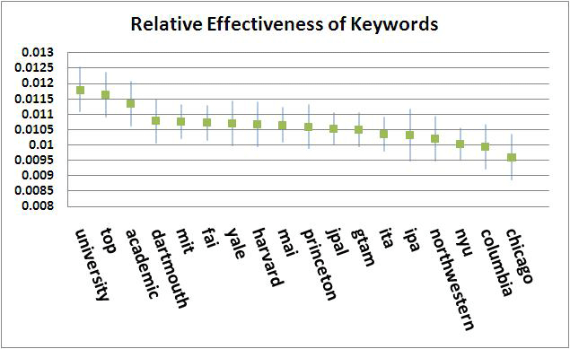
Dean Karlan just ran a fascinating experiment (HT Chris Blattman):

We designed one that would help us optimize our advertising strategy while also settling an important score: which academic institution's rep pulls the most weight in cyberspace? Our ad was simple:

Poverty Research

Breakthroughs to Fight Poverty

By [randomized] Researchers

Inside the brackets in the third line, Google ads then randomly inserted one of nine university names, one of three acronyms (IPA, JPAL, or FAI) , one of three "impostor" acronyms (ITA, GTAM, and MAI) that were phonetically similar to the real acronyms, or one of three generic words (university, top, and academic).

Dean then shows the picture depicting the results on ad effectiveness. Dean discusses relative rankings of different universities, but I think it's more interesting how a made-up acronym (MAI -- a variation on a real acronym FAI, which I even doubt many people recognize) did as well as Harvard (or more generally about as well or better than any university named).

This seems to confirm something I had noticed already: development academics' respect for academic brand-names (or any other measure of academic merit)  is not shared by the development policy community. Why is this?

Read More & Discuss

Who ya gonna call? Entrepreneurs!

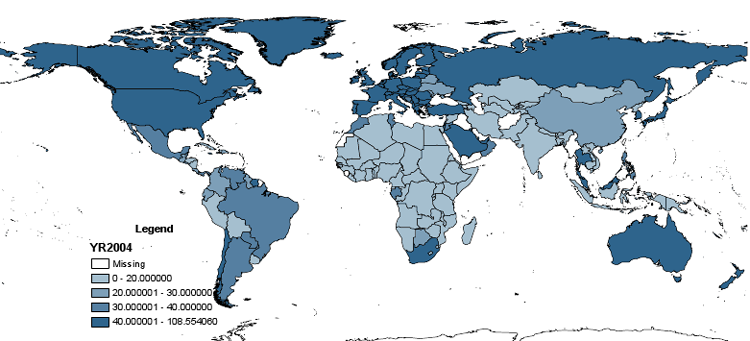
Just a decade ago it seemed we were stuck with landlines. State-owned telephone companies were largely entrenched, sclerotic organizations that provided poor, delayed, or simply unavailable service —even in some rich European countries, and nearly universally in poor countries. These maps (with data from 2001, 2004, and 2008) show how cell phones have quickly bypassed the dysfunctional landline companies and emerged as a triumph of bottom-up entrepreneurial success.

The measure is cell phone subscribers per 100 population, with darker shades of blue indicating movement from 0-20 to 20-30 to 30-40 to above 40 (above 40 is the dark blue shade that is most evident in all the graphs).

Note the darker blue color now encroaching on all sides of the African continent. This gives us hope that the dynamism of the bottom from entrepreneurs can overcome sclerosis at the top.

2001:

2004:

2008:

Data source: World Development Indicators

Read More & Discuss

Was that foreign aid … or a campaign contribution?

The scholarly literature on aid effectiveness focuses on answering one of two questions: 1) Is aid effective at causing growth? And 2) Is aid effective at reducing poverty? But what about when growth and poverty reduction aren’t the goals? What if the purpose of some aid is to influence a foreign election?

Some clever forensic statistic work is suggestive that bilateral donors use aid (ODA) to influence elections. They give more aid to friendly governments in election years...

An administration that is two standard deviations more politically aligned with the donor can expect to receive $19 million more in ODA flows during an election year relative to a non-election year than the less aligned administration.

And less aid to unfriendly governments in election years...

…an administration one standard deviation below the mean level of donor-alignment receives $8 million less on average during an election year.

It’s also suggestive that the results were most pronounced in highly-contested elections.

A recent example:

In [2006] elections, the U.S.-supported incumbent, the Palestinian Authority (P.A.), faced strong opposition from Hamas. In the weeks preceding the elections the United States Agency for International Development Assistance (USAID) funded several development programs including the distribution of free food and water, a street-cleaning campaign, and computers for community centers. The USAID money was even used to fund a national youth soccer tournament A progress report distributed to USAID and State Department officials was strikingly candid about the purpose of this aid:

“Public outreach is integrated into the design of each project to highlight the role of the P.A. in meeting citizens needs. The plan is to have events running every day of the coming week, beginning 13 January, such that there is a constant stream of announcements and public outreach about positive happenings all over Palestinian areas in the critical week before the elections.”

The whole paper, by Michael Faye of McKinsey and Paul Niehaus of UCSD, is here.

Read More & Discuss

New portal seeks to liberate aid data

UPDATE 3/26/10 11:50 EDT: Some readers have asked for more specific information on how AidData differs from the OECD project-level database. See the comments section for detailed answers from the AidData team. AidData, a new development finance data portal, was launched on Tuesday along with a companion blog called The First Tranche. From their inaugural post:

AidData 1.0…assembles more aid projects from more donors totaling more dollars than have ever been available from a single source before. AidData catalogues nearly one million projects that were financed between 1945 and 2009, adding or augmenting data on $1.9 trillion of development finance records. We currently have data from 87 different donors, and data from even more donors will come online every few months.

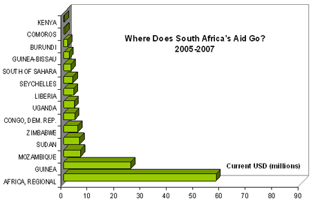
According to a report from the AidData conference in Oxford today, the new portal adds both breadth (more donors) and depth (greater detail at the project level) to the current aid data resources like OECD-CRS. The AidData portal contains some project-level data on where aid money flows from lesser-known donors like Saudia Arabia (Togo? Gambia?), South Africa (what’s going on with Guinea?), Kuwait, Poland, and Chile.

Presenters at the conference in Oxford this week based their work on the newly-available data from the AidData portal. They used the data to propose answers to questions like— - Does foreign aid bring about regime change? - Are “oil” donors like Saudi and Kuwait becoming more or less generous with rising income? - Will China remain a “rogue donor” or is it moving towards greater integration with traditional donors? Some exploratory tinkering with the site reveals that the AidData team—made up of scholars, researchers and practitioners from William and Mary, Brigham Young University, and Development Gateway—has created a relatively user-friendly interface on their site. The group’s geeky motto gets a second from Aid Watch: "Liberate the Data!"

-- Rescheduled NYU event for readers in New York: Professor Brautigam, American University professor and author of the new book The Dragon’s Gift: The Real Story of China in Africa, is giving a lunchtime seminar at NYU today. (The event was rescheduled because of a snowstorm in February.) Read our previous blog post on the book, or click here for more information about the event.

Read More & Discuss

Stop panicking: Capitalism repeatedly recovers from financial crises

UPDATE 2 (3/24, 12:59PM EDT) Tyler Cowen is almost convinced (see end of this post) UPDATE (3/23, 2:30 EDT): see GREAT responses by Ross Levine and Mark Thoma at the end of this post

I am just beginning to dive into the awesome book by Carmen Reinhart and Ken Rogoff, This Time is Different: Eight Centuries of Financial Folly. Along with great analysis, they have some wonderful pictures, evidence, and data. What I say here is my own take on it.

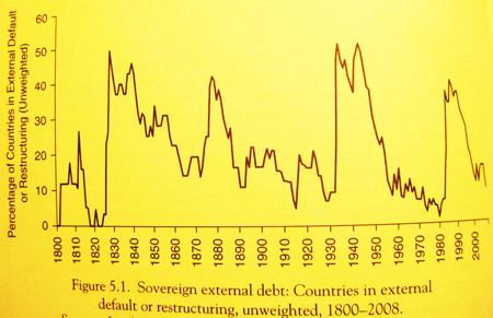
First, financial crises are remarkably common. Their Figure 5.1 shows the number of countries that have defaulted on their external debt (one possible dimension of a financial crisis) over the last two centuries. The numbers come in episodic waves of defaults and involve a remarkably high number of countries in each wave:

Second, the global capitalist system does well in the long run anyway.  Average per capita income in the world (a shaky estimate, but probably right order of magnitude) increased by a multiple of 12 over 1800-2008, despite repeated epidemics of financial crises.

The US is arguably the country with democratic capitalism the longest, and it also shows a steady upward trend from 1870 to the present, despite repeated banking crises (using those identified by Reinhart and Rogoff), with usually little effect of each crisis on output relative to trend (except for the Great Depression).

I don’t mean to minimize the short run pain that the current financial crisis has caused. It’s horrible. But there is no reason to panic about the long run growth potential looking forward.

The obvious rejoinder is Keynes’ “in the long run, we are all dead.” But we can’t ignore that Capitalism already survived repeated financial crises and has made us all vastly better off despite them. So here’s a counter-quote: “In the long run, we are all better off because our dead ancestors stuck with capitalism.”

UPDATE (3/23, 2:30PM EDT) Ross Levine, the scholar whom I trust most about addressing financial crises, sent me the following comment by email when I asked him his opinion:

This is a great summary! I would, however, point out that this crisis could be different, depending on your view of the adaptability and elasticity of institutions.  In particular, this crisis, including the build-up and the resolution, involved a massive redistribution of wealth to the very wealthy.  It also involved an unprecedented decline in market discipline through government policy.  Thus, from my perspective, to get the Reinhart and Rogoff result over the next decade or so, this must involve an institutional adjustment to correct the distorted incentives that currently exist.  What are the forces that lead to this type of adjustment in some economies and not in others?

Mark Thoma, on his great blog Economist's View, responded to my request for a comment. A summary (see his post for his full response):

My take is a bit different. The graph of per capita income from 1870 - 2008 seems to say we shouldn't worry that aggressive intervention to stimulate the economy will cause long-run problems. It may help substantially in the short-run, but the graph above indicates it's unlikely to have long-run consequences. So, I agree, let's not panic. Let's not panic and start reducing stimulus measures too soon, or be too timid with stimulative policies, out of fear it might harm long-run growth.

....

Finally, on the general "stop panicking" message, when people are hurting -- and they are -- we ought to panic. Legislators have given little indication that the understand the urgency of the employment problem we face. We need more panic, not less, about the employment situation.

UPDATE 2: Tyler Cowen on a view he "toys with but does not (yet?) hold":

Financial panics and economic crises are nearly inevitable...

More and more, people will turn to the wisdom of the great 19th century economists on financial panics, bank runs, and the like.  It was an intellectual mistake to think we had ever left that world for good.

Read More & Discuss

An oil purse is a curse, of course?

This post is by Adam Martin, a post-doctoral fellow at DRI. In development economics everyone knows that natural resources are a curse. A well-known study by Sachs and Warner found a negative correlation between resource abundance and growth rates, while subsequent studies have shown a negative relationship with democracy.

The Curse enjoys wide appeal. Aid skeptics like that it implicates oppressive domestic government and nationalized industries. Aid supporters are drawn to its emphasis on geography (destiny!) and the indictment of global markets. And on the popular level, no one makes a better villain than oil companies. But popularity doesn't stop the story from being hot, flat, and wrong.

New research argues that empirical work on the Curse suffers from two interrelated problems. First, it uses dependence (the share of GDP from that resource) and calls it abundance (the stock of a resource in the ground). But dependence in turn depends on institutional quality—if you have sound institutions, natural resources take their place along other industries. If not, natural resources will by default constitute a large share of GDP because poor institutions stifle an advanced division of labor. When you look at cross-sectional data using dependence as a proxy for abundance, it will look like natural resources compromise institutional quality.

That reliance on cross-sectional data is the second major problem. The Curse story does not claim that Nigeria is Britain plus oil, but rather that Nigeria is less democratic than Nigeria would be in the absence of oil. One way to get around this problem is to test whether oil makes country X less democratic using panel data with fixed country effects. That’s fancy econometric speak for taking into account other factors that might make country X more or less democratic—its history, institutions, culture, etc. Fixed effects also allow testing a corollary of the Curse known as the "First Law of Petropolitics": as oil prices go up, oil-rich autocrats crack down on democracy even more.

Digging into the recent research:

  • Christa Brunnschweiler and Erwin Bulte tackle the first problem. They find a positive correlation between resource abundance and both growth and institutional quality, and argue that it is conflict and poor institutional quality that lead to dependence.
  • Stephen Haber and Victor Menaldo offer a great review of the second problem. They present evidence that even natural resource dependence does not undermine democratization.
  • Romain Wacziarg corrects for both problems, testing for the effects of high oil prices on democracy using panel data. Again, there is no evidence for the Curse.

These studies argue that, while the Curse is plausible, domestic institutions are simply too persistent for it to matter much. Will belief in the Curse likewise prove too persistent in the face of new and better evidence?

Read More & Discuss

Take seriously the power of networks (or just look at some COOL maps)

A few days ago, I met a guy because he was my wife’s girlfriend’s boyfriend. He turned out to be a high ranking official who had some fascinating inside stories about aid and corruption in an African country (which I won’t name to protect his privacy). A local aid worker friend recommended an orthopedist to treat my wife’s badly injured ankle while we were in Addis Ababa. The orthopedist was able to give my wife relief (at full American prices, which went to his NGO) and then he asked if I knew that crazy aid criticizing NYU professor.

One of the best hiring decisions I ever made was to employ my friend’s wife’s neighbor’s daughter.

More and more people are discovering the power of social networks (consult the avalanche of popular books on connectedness and shrinking degrees of separation). Being well-connected to other people, who are in turn well-connected, is a powerful way to get information, to reduce search costs for employment or trade transactions, and to create strong incentives to behave well and protect your own reputation. Formal research in economics celebrates the economic payoff to social connectedness (aka social capital). Phenomena like the Hasidic diamond merchants of 47th street in Manhattan show the power of business networks based on ethnicity and family. Ethnic networks are common in Africa, like the Hausa traders in West Africa, or Luo fish merchants in Kenya.

The scorn usually shown for Nepotism and the Old Boy Network is so 20th century! The 21st century view is to respect the value of social connections wherever they come from!

OK, I’m exaggerating. You need to balance the value of social connections against accountability mechanisms, merit-valuing incentives, and ethical rules, so I don’t just hire my good-for-nothing cousin with other people’s money. Also you need to worry about people who are frozen out of networks through no fault of their own. But that is OFF MESSAGE, so I am going to ignore all that today.

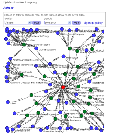
Venture capitalists rely heavily on social networks to assess reputation and to make new deals. And so do social entrepreneurs. Someone tipped me off to xigi.net, which is a fantastic web site for facilitating networks among social entrepreneurs:

xigi.net (pronounced 'ziggy' as in zeitgeist) is a space for making connections and gathering intelligence within the capital market that invests in good. It’s a social network, tool provider, and online platform for tracking the nature and amount of investment activity in this emerging market.

OK, I confess, what really got me to look at this site was the hyper-cool network maps that show connections between the social entrepreneurs. Check out the map for the deservedly well-connected Ashoka folks of Bill Drayton (this is a screen shot, but you have to visit the map on the xigi site to explore its cool functionality).

The point is that part of the effectiveness of Ashoka is because they are so well connected, and they make all their partners in turn more effective in turn by being connected to the well-connected Ashoka.

We could keep dreaming: social networks could be a powerful vehicle for spreading information and evaluations about existing aid projects and actors. The Internet makes this much more feasible that it used to be. GlobalGiving.org is one initiative that tries to implement this idea. Oh, and I happen to know about and trust GlobalGiving because I have known the two founders ever since we worked together on Russia in the early 90s.

I had never heard of xigi.net until a couple days ago. I heard about it from my wife’s girlfriend, the one who had the aid and corruption story-telling boyfriend.

Read More & Discuss

Don’t cite global numbers unless you know they’re trustworthy (They usually aren’t)

Precisely 1.419 billion live in extreme poverty in our world today. Oh, and it’s equally plausible that precisely 0.874 billion live in extreme poverty. Or maybe it’s 1.7517 billion. Most development people confidently cite global statistics without knowing what they are based on. Sorry, that’s no longer allowed with today’s greater demands for transparency. Angus Deaton’s AEA Presidential Address just given at the AEA meetings will not let you ever trust the World Bank again on how many people in the world are in extreme poverty.Some nuggets:

1) “India has become poorer because India has become richer!”

The World Bank’s recent 40 percent upward revision of the global poverty number was based on an absurd procedure that led to the paradox in the quote.

To make a long story short, the World Bank decided to boot richer India out of the group of poorest countries used to determine the poverty line, which made the poverty line higher, which made Indian (and global) poverty higher – all because India was richer. This misguided revision of the poverty line, which accounted for virtually all of the upward revision, was not clear to virtually anyone until this new paper by Deaton.

Deaton doesn’t say this, but the World Bank behavior on calculation and publicity around this number was not exactly their finest hour.

2) Adjusting for purchasing power (how cheap the goods are) across countries is complex and probably impossible.

The details are as incredibly boring as they are hugely consequential.

As only one tiny example, the poverty count is sensitive to a mostly-made-up number that is incomparable across countries: the imputed rent to housing.

Then there is the “index number problem,” which only is of great fascination to 2 people, but unfortunately can change the ratio of US/Tajikstan incomes by a factor of 10. The trouble is that rich people and poor people consume very different things. For example, poor people may consume a lot of something that is cheap in the poor country, which is not consumed much and is expensive in the rich country. Similarly, rich people consume a lot of something else that is cheap in the rich country and expensive in the poor country.  If you use rich country prices, you exaggerate poor people’s consumption basket value (they are given a lot of credit for consuming a lot of something very expensive, but it isn’t that expensive in the poor country and if it were, they would consume a lot less of it). Conversely, if you use poor country prices, you exaggerate rich people’s consumption basket value. There are possible intermediate solutions but no complete solutions to this intractable problem.

Deaton muses: “perhaps we are aiming too high when we try to construct a real income scale on which every country in the world can be placed.”

3) Why don’t you just ask people if they think they are poor?

Gallup's World Poll does.

In contrast to the World Bank global poverty rate of 25 percent (around which there were those misguided revisions and many other uncertainties on the order of 40 percent of the original estimate):

33 percent worldwide say they don’t have money for food, 38 percent say their living standards are poor, and 39 percent say they are “in difficulty.”

So you are on safe ground saying, “there are lots of people in poverty.” But don’t insult our intelligence with an exact number.

4. Deaton offers consolation: you don’t really need a global poverty number.

In spite of the attention that they receive, global poverty … measures are arguably of limited interest. Within nations, the procedures for calculating poverty are routinely debated by the public, the press, legislators, academics, and expert committees, and this democratic discussion legitimizes the use of the counts in support of programs of transfers and redistribution. Between nations where there is no supranational authority, poverty counts have no direct redistributive role, and there is little democratic debate by citizens, with discussion largely left to international organizations such as the United Nations and the World Bank, and to non-governmental organizations that focus on international poverty. These organizations regularly use the global counts as arguments for foreign aid and for their own activities, and the data have often been effective in mobilizing giving for poverty alleviation…It is less clear that the counts have any direct relevance for those included in them.

Deaton is apparently not a big fan of the Millennium Development Goal approach of international accountability for precise reductions in global poverty numbers, which will be a tad difficult when you don't know what those numbers are.

Preview of coming attractions: other global numbers are also based on a firm foundation of wet sand. The people who claim to know the exact number of hungry people in the world … you might want to start issuing mucho disclaimers now.

Read More & Discuss

The effects of foreign aid: Dutch Disease

This blog post was written by Arvind Subramanian, Senior Fellow at the Peterson Institute for International Economics and Center for Global Development, and Senior Research Professor at Johns Hopkins University.

The voluminous literature on the effects of foreign aid on growth has generated little evidence that aid has any positive effect on growth. This seems to be true regardless of whether we focus on different types of aid (social versus economic), different types of donors, different timing for the impact of aid, or different types of borrowers (see here for details).  But the absence of evidence is not evidence of absence. Perhaps we are just missing something important or are not doing the research correctly.

One way to ascertain whether absence of evidence is evidence of absence is to go beyond the aggregate effect from aid to growth and look for the channels of transmission. If we can find positive channels (for example, aid helps increase public and private investment), then the “absence of evidence” conclusion needs to be taken seriously. On the other hand, if we can find negative channels (for example, aid stymies domestic institutional development), the case for the “evidence of absence” becomes stronger.

One such channel is the impact of aid on manufacturing exports. Manufacturing exports has been the predominant mode for escape from underdevelopment for many developing countries, especially in Asia. So, what aid does to manufacturing exports can be one key piece of the puzzle in understanding the aggregate effect of aid.

In this paper forthcoming in the Journal of Development Economics, Raghuram Rajan and I show that aid tends to depress the growth of exportable goods. This will not be the last word on the subject because the methodology in this paper, as in much of the aid literature, could be improved.

But the innovation in this paper is not to look at the variation in the data across countries (which is what almost the entire aid literature does) but at the variation within countries across sectors. We categorize goods by how exportable they could be for low-income countries, and find that in countries that receive more aid, more exportable sectors grow substantially more slowly than less exportable ones. The numbers suggest that in countries that receive additional aid of 1 percent of GDP, exportable sectors grow more slowly by 0.5 percent per year (and clothing and footwear sectors that are particularly exportable in low-income countries grow slower by 1 percent per year).

We also provide suggestive evidence that the channel through which this effect is felt is the exchange rate. In other words, aid tends to make a country less competitive (reflected in an overvalued exchange rate) which in turn depresses the prospects of the more exportable sectors. In the jargon, this is the famous “Dutch Disease” effect of aid.

Our research suggests that one important dimension that donors and recipients should be mindful of (among many others that Bill Easterly has focused on) is the impact on the aid-receiving country’s competitiveness and export capability. That vital channel for long run growth should not be impaired by foreign aid.

Read More & Discuss

Why there’s no “GrowthGate:” Frustration vs. Chicanery in Explaining Growth

Despite Climategate, even a superficial reading seems to indicate that there is enough evidence for effects of man-made activity on the climate. Surprisingly, there is a lot less evidence for effects of man-made activity on something that actually is completely man-made: the rate of economic growth in each country.

I had this frustrating thought as I was reading an important new paper, “Determinants of Economic Growth: Will Data Tell?” [1]

The paper gives a conclusive and resounding answer to the question in the title: no. 

It has taken economists a lot of hard work to attain this level of sublime ignorance. There were three steps in the the great History of Evolving Cluelessness:

  1. Economists spent the past two decades trying every possible growth determinant in sight. They found evidence for 145 different variables (according to an article published in 2005). That was a bit too many in a sample of only about one hundred countries. What was happening is there would be evidence for Determinants A, B, C, and D when tried one at a time to explain growth. But the evidence for A disappeared when you also controlled for some combination of B, C, and D, and/or vice versa. (Interestingly enough, foreign aid never even merited inclusion in the list of 145 variables.)
  2. The Columbia economist Xavier Sala-i-Martin and co-authors ran millions of regressions on all possible combinations of 7 variables out of the many possible determinants of growth. Skipping a lot of technical detail, they essentially averaged out the millions of regressions to see which determinants had evidence for them in most regressions. There was hope: some were robust!  For example, the idea that malaria prevalence hinders growth found consistent support.
  3. This new paper by Ciccone and Jarocinski found that every time the growth data are revised, or if the sample is changed to another equally plausible one, the results vanish on the “robust” variables and new “robust” variables appear. Goodbye, malaria, hello, democracy. Except the new “robust” determinants are no longer believable if minor differences between equally plausible samples changes what is robust. So nothing is robust.

 There are two possible ways to describe what had happened over the past two decades:

  1. The growth research was at least partially fraudulent, in that we researchers were searching among many different econometric exercises till we got the “determinants of growth” we wanted all along.
  2. There was a good faith effort by us researchers to test different theories of growth, which led to some results. We didn’t realize until later that these results were not robust.

Description (1) would be a “GrowthGate,” but since so many people would be guilty (of "data mining"), and since we really can’t tell for any individual study or researcher whether it was (1) or (2), “GrowthGate” never became a story.

The only guilty ones might be those who continue to run growth econometrics today without acknowledging that our Three-Act Tragi-Comedy is so OVER. Like for example, I wonder a little why pay attention to some hot new study that claims to have finally found that big POSITIVE effect of aid on growth, or POSITIVE anything on growth.

thomas_friedman

Of course, the policy world abhors the great Vacuum of Ignorance, which opens the door to empty pontificators like a certain bestselling writer of books about Flat Worlds, in which You Cannot Have Growth Unless You Do Precisely What I Tell You.

Thank goodness, many economists did good economics before the Dark Age of  Growth Econometrics, and many economists have still managed to do it during and after. Economics is so much more,  even if the cross-country econometric data refuse to tell us The Exact Determinants of Growth.

-----

[1] By Antonio Ciccone and Marek Jarocinski, ICREA-Universitat Pompeu Fabra; and European Central Bank.

[2] Durlauf, Steven N., Paul A. Johnson, and Jonathan R. W. Temple, 2005, “Growth Econometrics,” in Philippe Aghion and Steven N. Durlauf, eds., Handbook of Economic Growth, North-Holland.

[3] Sala-i-Martin, Xavier, Gernot Doppelhofer, and Ronald I. Miller, 2004, “Determinants of Long-Term Growth: A Bayesian Averaging of Classical Estimates (BACE) Approach,” The American Economic Review, 94(4):813–835.

Read More & Discuss

Copenhagen Special: Climategate and the tragic consequences of breaching scientific trust

62C34-iglooClive Crook is such a calm, sensible, non-ideological voice, that if you ever get him really upset, you're in deep trouble.  And he could hardly contain himself at his blog at the Atlantic on Climategate, in which some climate scientists engaged in censorship and cover-ups:

The closed-mindedness of these supposed men of science, their willingness to go to any lengths to defend a preconceived message, is surprising even to me. The stink of intellectual corruption is overpowering.

Clive is also hard on the head of the Intergovernmental Panel on Climate Change (IPCC) who saw no problems of bias, even when contributing scientists said about studies they didn’t like: they “will keep them out {of the IPCC report} somehow - even if we have to redefine what the peer-review literature is!"

One problem that Clive points out is that some climate scientists don’t know that much about statistics and show little interest in consulting statisticians even while they are basing their finding on statistical analysis. The Wegman report on the “Hockey Stick” controversy has this amazing summary:

It is important to note the isolation of the paleoclimate community; even though they rely heavily on statistical methods they do not seem to be interacting with the statistical community.

Once the real statisticians looked, one "Hockey Stick" result fell apart: the conclusion that

the decade of the 1990s was the hottest decade of the millennium and that 1998 was the hottest year of the millennium cannot be supported by {the} analysis.

Clive considers some of the reactions to his blog in a subsequent post, and is unyielding:

Once scientists set out to mislead the public, they can no longer expect to be trusted. End of story.

So is Clive a climate “denialist”? Or am I a “denialist” by featuring this story on the opening day of Copenhagen?

That such questions are even on the table is itself a symptom of the problem. A less balanced but still insightful piece by George Will in Sunday’s Washington Post complains bitterly about this. Part of the problem is the real “denialists,” who DO ignore science -- but scientific dishonesty is not exactly a confidence-building response.

The analogy that got me interested in Climategate is of course with social science in development, where the problem is vastly worse. Advocacy on global poverty distorts everything from the data to the econometrics, as this blog frequently complains, so that credibility of development social scientists is sinking to dangerously low levels. It’s so bad that there is never a “Povertygate” scandal, because “Povertygate” is the norm rather than the exception.

What’s most tragic about both climate and poverty advocates engaging in censorship and distortion is that, while it might help advocacy in the short run at the expense of science, it destroys both advocacy and science in the long run. It’s infeasible for every individual to independently do their own research to verify problems and proposed solutions, so they have to trust the professional, full-time researchers. As Clive understood, if those researchers destroy that trust, then even honest advocacy becomes increasingly impossible, which means solutions become increasingly impossible.

Since any meaningful agreement on emissions at Copenhagen is about as likely as igloos in the Sahara, maybe the delegates could pass a resolution in defense of responsible criticism?

Read More & Discuss

“The statistical evidence from this study therefore suggests that as far as happiness is concerned, it is better to give than to receive aid.”

Source The World Database of Happiness, masterminded by Professor Ruut Veenhoven at Erasmus University in Rotterdam, provides the visitor with a vast searchable inventory of empirical findings on happiness, helpfully organized and cross-referenced.

However, the authors of a very concise paper published last April in the Atlantic Economic Journal (subscription required) have called attention to a shockingly neglected gap in the aforementioned scholarly literature: None of the existing studies has yet untangled the relationship between a state of insanely blissful delight and foreign aid.

B. Mak Arvin and Byron Lew of Trent University in Ontario, Canada, turn their attention first to donor countries, using happiness data from the World Database of Happiness and all other figures from the World Bank. Controlling for income, inflation and employment, they find happier countries give more aid: “the happiness coefficient is positive and statistically significant at the 5% level” and “a one-unit increase in happiness leads to an increase in the donor’s aid to GDP ratio…by 0.132 of a percent.” At the same time, “aid is a significantly positive determinant of a donor’s happiness.” There seems to be a virtuous circle between a 1.31217 standard deviation increase in the joy of giving and the parameterized, rigorously assessed impact on the act of giving.

Looking at recipient countries, the authors come to two conclusions: one predictable and one less so. First, controlling for income of recipient, donors are remarkably insensitive to the plight of the unhappy: “happiness has no statistically significant impact on the receipt of aid.” Second, “aid has no statistically significant influence on happiness, although income does.” Alas aid is not only ineffective in 15 other ways already covered by the literature, it also does not meet the goals of the country-owned, fully participatory Joylessness Reduction Strategy Paper.

Or doesn’t it? We were a little unclear on whether this paper was any more successful than other cross-country regressions that afflict the aid literature at resolving convincingly what causes what, whether the correlation is robust or was the result of data mining, and whether both happiness and aid are driven by some third factor, like cross-country differences in raw sex appeal.

It’s not easy being an aid researcher. In fact, we observe, anecdotally, that aid researchers are kind of unhappy….

--

(Thanks to reader Tomas for the tip.)

Read More & Discuss

The Political Economy of Aid Optimism or Pessimism

Bill and Melinda Gates are making a big media presentation today at 7pm of their Living Proof Project, in which they document aid successes in health. They call themselves “Impatient Optimists.” We can comment more after we hear their presentation. However, they invited comment already by posting progress reports on the Living Proof website. Actually, we have also previously argued that aid has been more successful in health than in other areas.  However, one petty and parochial concern we had about the progress reports is that Bill and Melinda Gates continue to make a case for malaria success stories based on bad or fake data that we have criticized on this blog already twice. The Gateses were aware of our blog because they responded to it at the Chronicle of Philanthropy.

Yet they continue to use the WHO 2008 World Malaria Report as their main source for data on malaria prevalence and deaths from malaria in Africa. As we pointed out in the earlier post, the report establishes such low standards for data reliability that some of the numbers hardly seem worth quoting. From the WHO report: “reliable data on malaria are scarce. In these countries estimates were developed based on local climate conditions, which correlate with malaria risk, and the average rate at which people become ill with the disease in the area.” Where convincing estimates from real reported cases of malaria could not be made, figures were extrapolated “from an empirical relationship between measures of malaria transmission risk and case incidence.”

In Rwanda, which the Gateses say showed a dramatic 45 percent reduction in the number of deaths from 2001 to 2006, a closer look at the WHO data shows that there is an estimate of 3.3 million malaria cases in 2006, with an upper bound of 4.1 million and a lower bound of 2.5 million. And, according to which method is used to estimate cases, the trend can be made to show that malaria incidence is actually on the rise. The Gateses also highlight Zambia as a “remarkable success,” claiming that “overall malaria deaths decreased by 37 percent between 2001 and 2006.” While they provide no citation for this figure it appears to come from the very same WHO report, which concedes that compared to African countries with smaller populations, “nationwide effects of malaria control, as judged from surveillance data” in Zambia are “less clear.”

The downside of all this is that it appears we are having no effect whatsoever on the Gates’ use of fake or bad numbers and thus on the highest profile analysis of malaria in the world. The Gateses ignore our recommendation (and that of others) that they invest MUCH more in better data collection to know when GENUINE progress is happening. (Would Gates have put up with a Microsoft marketing executive who reported Windows sales were somewhere between 2.5 and 4.1 million, which may be either lower or higher than previous periods’ equally unreliable numbers?)  Are we insanely pig-headed for insisting that African malaria data be something a little more reliable than if the Gateses had asked the pre-K class at the Microsoft Day Care Center to give their guess?

Well, this is the third time we are saying this on this blog, so maybe we should give up. When people like the Gateses are so tenacious in the face of well-documented errors, it’s time for us economists to shift from normative recommendations (don’t claim progress based on pseudo-data!) to positive theory (what are the incentives to use bad numbers?)

What is the political economy of “impatient optimism”? Here is a possible political economy story – there are two types of political actors: (1) those who care more about the poor and want to make more effort to help them relative to other public priorities, and (2) those who care less and want to make less effort relative to other priorities.

Empirical studies and data that show that aid programs are having very positive results are very helpful to (1) and not to (2), while of course the reverse is helpful to (2) and not to (1). So each type has an incentive to selectively choose studies and data. Knowing this and knowing the public knows this, the caring type (1) might want to signal they are indeed caring by emphasizing positive studies and data, and may have no incentive to actually evaluate whether the positive data are correct or not. So the Gateses might want to say (as they did): “The money the US spends in developing countries to prevent disease and fight poverty is effective, empowers people, and is appreciated.”

If this purely descriptive theory is true, it could explain why some political actors stubbornly stick to positive data even if some obscure academic argues it is false or unreliable.

It cuts both ways – the anti-aid political actors would also have no incentive to recheck their favorite data or studies. Then the debate over evidence will not really be an intellectual debate at all, but just a political contest between two different political types.

Of course, we HATE this political economy theory when it’s applied to US. We are VERY unhappy when people conclude that because we are skeptical about malaria data quality (and thus whether they show progress), therefore we really don’t care about how many Africans are dying from malaria and wish that all government money went to subsidize fine dining in New York. And, the Gateses would probably not be fond of this political economy explanation of their actions and beliefs either. Both of us would prefer the alternative “academic” theory of belief formation, in which it is all based on evidence and data, not political interests.

How to distinguish which theory explains the behavior of any one actor is determined by the response to evidence AGAINST one’s prior position – do you change your beliefs at all? The Gateses seem to fail this test on malaria numbers. We hope we do better when it comes our time to be tested, as we should be.

Read More & Discuss